
Six days after Thanksgiving and you only thought you were done with leftovers. It's that time of year when we share some of our SLANT leftovers of delicious creative work that was shoved in the fridge by the client and never heard from again.
A Monk Walks Into A Bar...

Back in 2014 brewmaster Palmer Quimby approached SLANT seeking a new brand for his new brewing company. His inspiration? Get ready for this: a Monk.
Branding a thing that does the thing with those other things that do all their things...

Sometimes we’re asked to name and/or brand a physical product or company with an easily identifiable function, other times it's a little more complicated.
Thanksgiving Leftovers
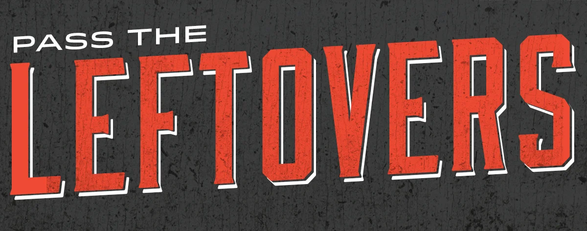
Leftovers come in two forms: the ‘lumpy, what-the-hell-even-is-this’ kind, or the ‘omg-this-is-just-as-good-maybe-even-better-than-the-original’ kind. SLANT leftovers fall in this second category...
Gettin’ Down & Dirty With Morgan Corp.

What's green and moves tons of dirt?? Meet Morgan Corp, one of the industry's best...and they're a new client.
Connecting (literally) With The Mary Black Foundation

SLANT is excited to announce continued work with the Mary Black Foundation out of Spartanburg, SC. As we wrap up a fresh new brand for the Foundation’s CONNECT adolescent health initiative, we’re now set to engage in a rollout campaign and website.
NIGHT OF THE LIVING DEAD...

In keeping with the Halloween spirit, we thought we'd show off some work that was KILLED IN COLD BLOOD, never to see the light of day. (ok, so the work was "politely dismissed" but that doesn't sound very halloweeny). Have fun browsing the land of the dead. MUWAHAHAHA....
We Got Sneaky w/ Sneaker

If you’re a Charleston sneakerhead, JP Hudson needs no introduction. For those uninitiated, JP is is the visionary behind Sneaker, Charleston’s new destination for exclusive sneakers and apparel. So now that we all know each other, let us tell you how JP and SLANT made some serious cool on King Street.
Changing the world, one city at a time

This morning at 9AM, we officially launched a new website and brand for the City of Spartanburg, SC. SLANT was awarded the bid back in April to design a more user-friendly and vibrant website that would allow the City to more easily connect with its residents.
CO: Vietnamese for Feast
![]() At CO, brainchild of Charleston restauranteur Greg Bauer, the Vietnamese word for 'feast' couldn't have been a more appropriate name…'cause it's a feast for your mouth and your eyes.
At CO, brainchild of Charleston restauranteur Greg Bauer, the Vietnamese word for 'feast' couldn't have been a more appropriate name…'cause it's a feast for your mouth and your eyes.
Greg Bauer had more than just food in mind when he decided to open an authentic Vietnamese restaurant in the heart of downtown Charleston, SC. He envisioned fresh, authentic and affordable Vietnamese food in a modern chic environment. And since he knew that the look and feel would be just as important as his succulent dishes, he turned to SLANT to establish CO's brand and identity.
 Who's ready for a cocktail?After drooling over the menu and signature cocktail recipes, it was evident that this was no ordinary ethnic restaurant. So we not only developed unique logo, but one that truly encompasses what CO is all about. The curvilinear lines that encompass the logo's container were inspired by the curved landforms of Vietnamese rice fields, the flowing shape of the noodles found in the cuisine as well as the feminine eyelash – a nod to the beauties of 1960s Vietnamese cinema. The vibrant red color palette chosen for the logo was such an inspiration for the client, it became the accent color throughout the restaurant itself.
As CO's creative agency of record, we happily do our jobs by stuffing our face with Banh Mi, Pho, and dumplings on a regular basis all while managing and monitoring both print and online advertising campaigns. Through careful design and placement (and very tasty cuisine) CO has seen immense success and has exceeded revenue expectations in the first six months of operation.
So, we'll see you at CO for happy hour then...
PS: the blog post headline that didn't make it: 'Nam Noms (see what we did there?)